Six Week Spotlight
Local artists submit proposals for a six-week-long exhibit. Exhibitions are selected based on the evaluations of a guest juror. Three to four artists are normally selected for a given year.
Eligibility:
Open to all resident artists of the Chilkat Valley. Solo and group proposals are accepted. Exhibit proposals must include a written narrative describing the art, and the artists’ overall exhibit concept. We will be requesting a number of images of current work. If you are unfamiliar with the Hakkinen Gallery, we suggest you stop in before applying. There is a lot of wall-space for art! A combined showing, with two or more artists, works well. Please don’t hesitate to consider this approach. To receive an application form, send an email inquiry to: operations@sheldonmuseum.net
PAST SIX WEEK SPOTLIGHT ARTISTS
2019
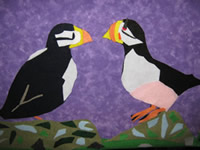
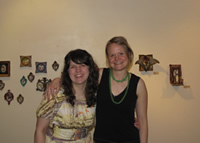
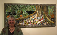
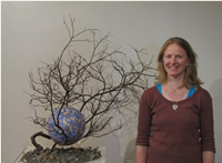
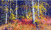
Rachael Juezeler
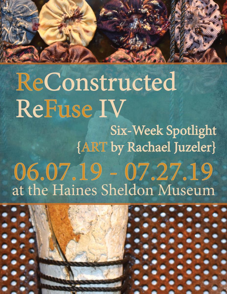
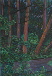
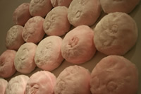
In her work, Juzeler highlights the beauty of discarded objects by reimagining their purpose and assembling them into strikingly beautiful works of art. ReConstructed ReFuse IV features a selection of chandeliers, wall pieces, mosaics, and a stunning “rust tapestry”. Each artwork is made from salvaged and “waste” materials, ranging from broken window glass and abandoned foundry blocks to reclaimed scrap wood and rusted metal shards. In her words: “My work reflects the lost history of Southeast Alaska, as well as incorporating waste and found materials from our throwaway society, acknowledging our past and our sense of place, while illuminating a path forward, presenting an alternative vision of how to deal with our waste moving into the future.”
ReConstructed ReFuse IV illuminated the Hakkinen Gallery from June 7th – July 27th, 2019.
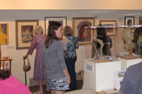
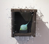
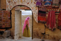
ReConstructed ReFuse IV, gallery interior
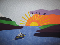
Donna Catotti & Rob Goldberg

Poster – Complementary Colors: Alaska to Arizona
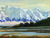
A husband and wife team of professional artists, Catotti and Goldberg work independently in several mediums. The couple met over 30 years ago at the prompting of a mutual friend who told them, “You like the same colors.” At the time, Catotti was mostly painting the southwest desert. Goldberg was mostly painting Alaskan landscapes. They each looked forward to a wider range of landscape colors, from the cool blues and purples of Alaska to the warm reds and browns of the desert southwest.
The idea for Complementary Colors, contrasting Alaska and Arizona, came in 2017 when Catotti was participating in a show at the Desert Art Museum in Tucson and doing some painting in the area. Complementary Colors will feature new paintings by both artists, including plein air paintings and color studies, as well as guitars by Goldberg. Cattoti will also display several Studio Incamminati workshop paintings, as yet unfinished, to lend the audience an idea of the painting process.
On display in the Hakkinen Gallery August 2nd – September 14th, 2019.
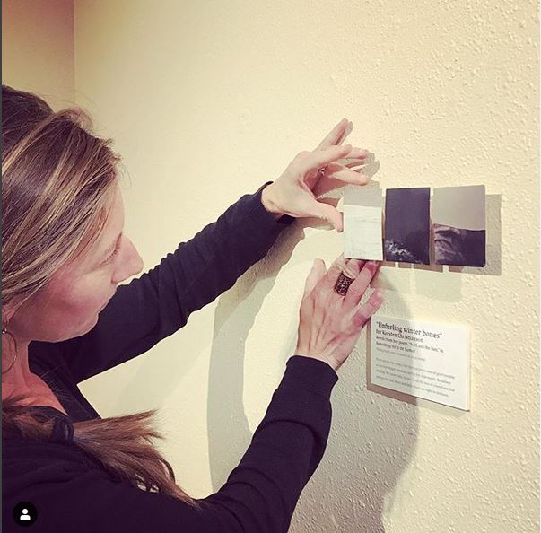
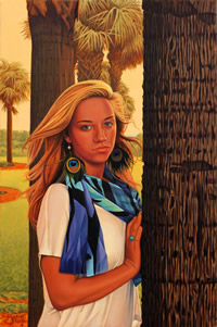
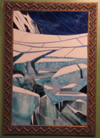
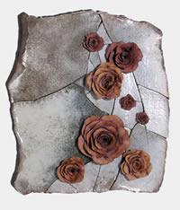
Katie Craney
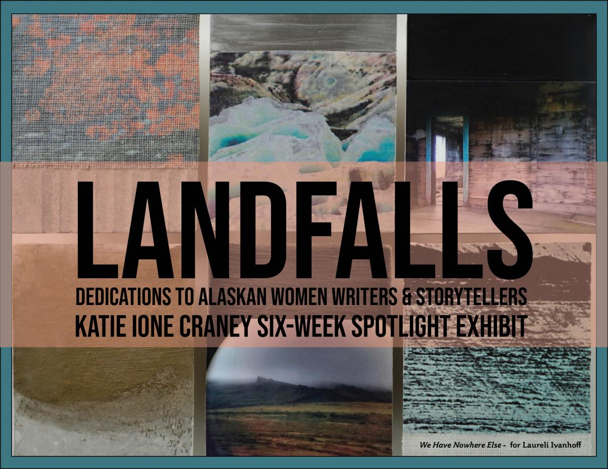
Landfalls
2018
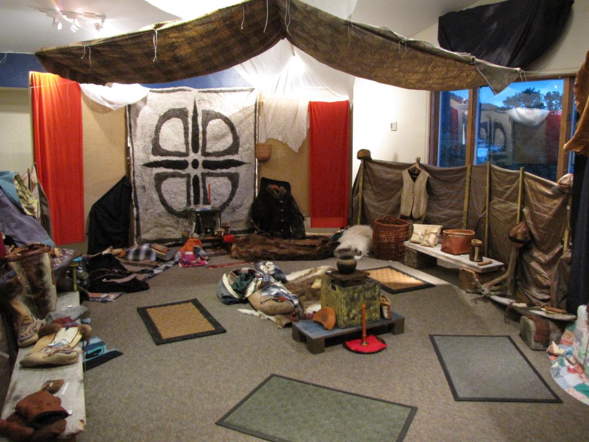
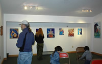
Art Confluence
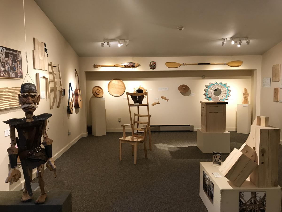
Forest to Finish, gallery interior
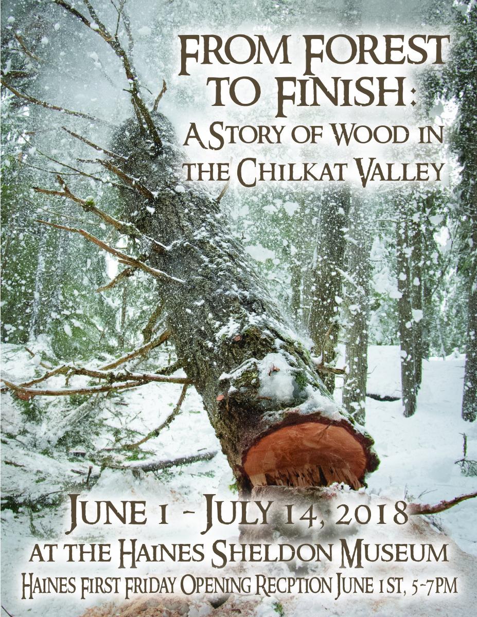
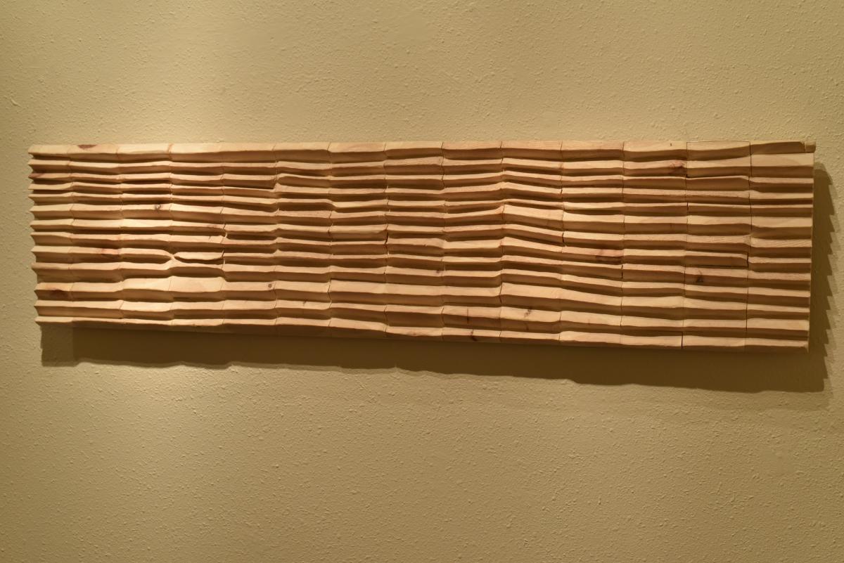
Each locally manufactured wood product has a story. From the role the seedling and growing tree plays in our ecosystem, to the people who touch and handle the tree, to the stages of local manufacturing, to the residents and visitors who utilize and enjoy the final item, the wood products in our Valley are touched by many. “From Forest to Finish” showcased the breadth of local wood products, with products from 40 established and emerging artisans, entrepreneurs, and local forestry workers.
The exhibit celebrated our forests, the role the trees play in our valley, and the people who are supported by our vast and beautiful timber resource. “Forest to Finish” was curated by the Alaska Arts Confluence, a local non-profit in the Chilkat Valley.
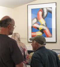
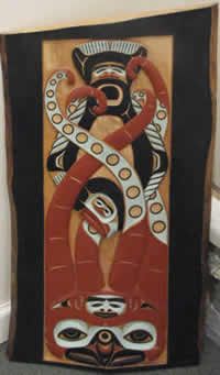
John Hagen
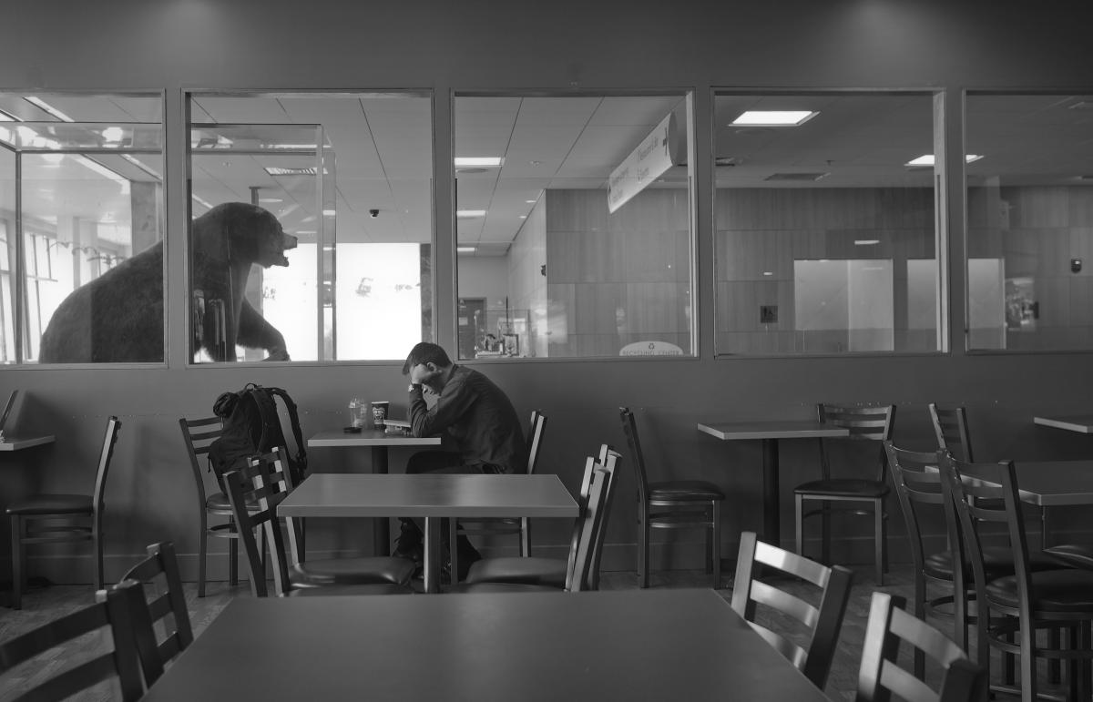
Bear, Juneau Airport
Alaska’s major cities – Anchorage, Juneau and Fairbanks – are sometimes mocked for not being the “real” Alaska. The pavement, amenities and buildings don’t exude the wildness of Alaska like remote and rural parts of the state. Yet even in our Alaska cities we try to remind ourselves, and our visitors, that the “true” Alaska is only a short drive or hike away.
Brown bears are a popular and powerful symbol of Alaska. They’re a strong symbol of Alaskans livelihood and identity. They represent the very real wildness of Alaska that still exists, and the dangerous that exist there. We use bears to express that wildness and Alaskans use bears to bring the wild into our cities. We use them to remind people in malls, airports and gift stores that they are still in Alaska, even if safely surrounded by walls and buildings.
But the symbolism also expresses another idea – that Alaska has been civilized. By using the symbol of the bear in our urban centers, we are also reminded the wild has been conquered and that things that can hurt us can also be hunted, stuffed and put inside for our enjoyment.
This idea of bringing the Alaska wilderness into our urban centers is an idea about our sense of place. Location is the heart of identity for most Alaskans. The inspiration for my work is a fascination with how people respond to the world around them. This series – half-seriously, half humorously – explores how we use taxidermy brown bears to bring the wilderness to us.
John Hagen
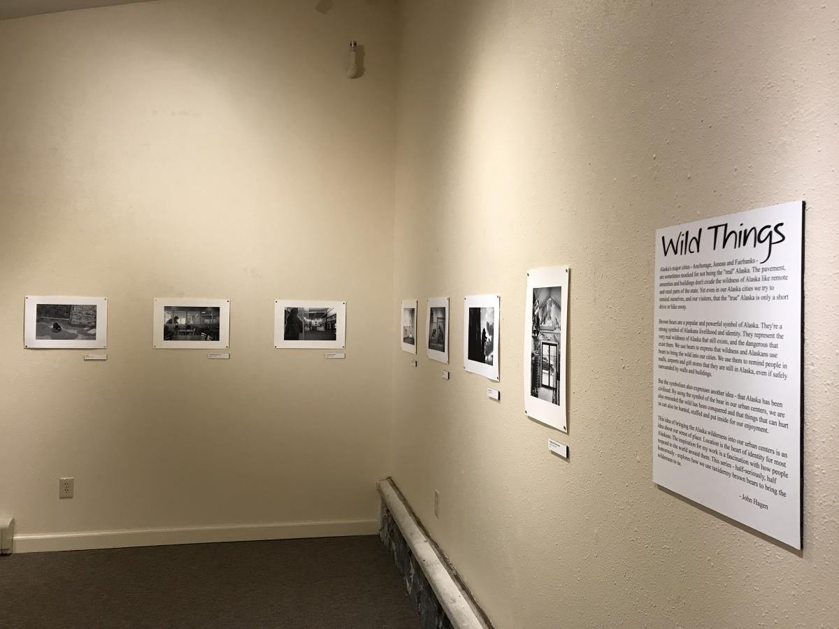 Wild Things, gallery interior
2017
Chris Nowicki
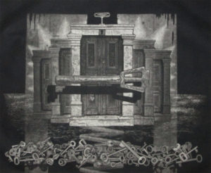
Keys
Traditional printmaking techniques are the foundation of modern printmaking. The idea of creating multiples by hand that are identical is not new but the skill in creating them is slowly being lost. It is important to retain these traditional techniques that require skillful and sometimes time consuming effort.
Mezzotint, my personally preferred method, was almost entirely lost at the beginning of the 1900’s. It was replaced by newer and faster techniques. But eventually artists rediscovered it and began to appreciate it for its creative advantages. Now it enjoys a certain respect and popularity among printmakers.
With my work I try to touch reality in a different way. I create a surrogate reality that is a transformation of our everyday observations. I use unreal perspectives and juxtapose objects in ways that I feel show a different viewpoint on our existence as humans.
My ‘Entropy’ series, for instance, is not just a study of deteriorating machines. It is a statement about our abbreviated existence in time. People should remember that everything returns to nature, even us. The ‘Doors’ series deals with making decisions and how we feel confined within our society and political systems. These ideas are too often pushed to the background by information systems that are overwhelming in their scope and efficiency.
Printmaking to me is a language, as are other creative methods such as music and dance. This language is able to display ideas in a direct way that often, for me, is better than words. The mezzotint technique has been used for over 350 years to communicate ideas. I use it to encourage people to think deeply about themselves and life.
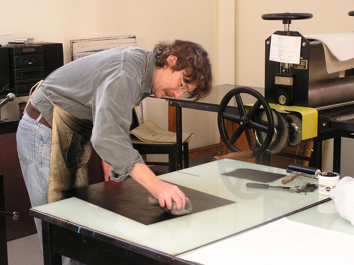 Mezzotint process
Christopher Nowicki first learned screen printing in high school. He studied at the prestigious Toledo Museum of Art School of Design in Toledo, Ohio, completed his Masters studies at the University of Washington in Seattle in 1977, and worked in commercial screen printing shops throughout his school years. After graduate school, Chris taught serigraph and metal-plate and stone lithography at Seattle’s Pratt Fine Arts Center in Seattle.
In the early ‘80s, Chris began making prints for Native artists. He has printed for Northwest Coast artists Duane Pasco, David Boxley, Terry Williams, Barry Herem, George David and John Goodwin. In 1989 he exhibited at the Desa Gallery in Wroclaw, Poland, and began a lifelong relationship with Polish print making. In 1993, Chris decided to move to Poland. Two months before he was set to depart, Lee Heinmiller, director of Haines’ Alaska Indian Arts, invited Chris to print limited editions for local Native artists. Since then, Chris has returned every summer to Haines to print for Native artists. He has printed over 120 editions of Northwest Coast prints. During the winter, Chris lives in Poland, and teaches at the Eugeniusz Geppert Academy of Art and Design in Wrocław. He teaches workshops around the world and curates international exhibitions of printmaking.
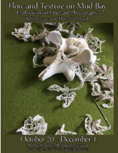
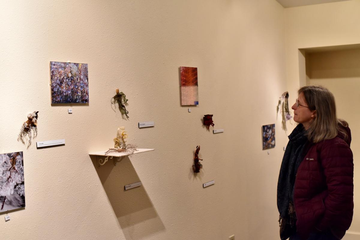
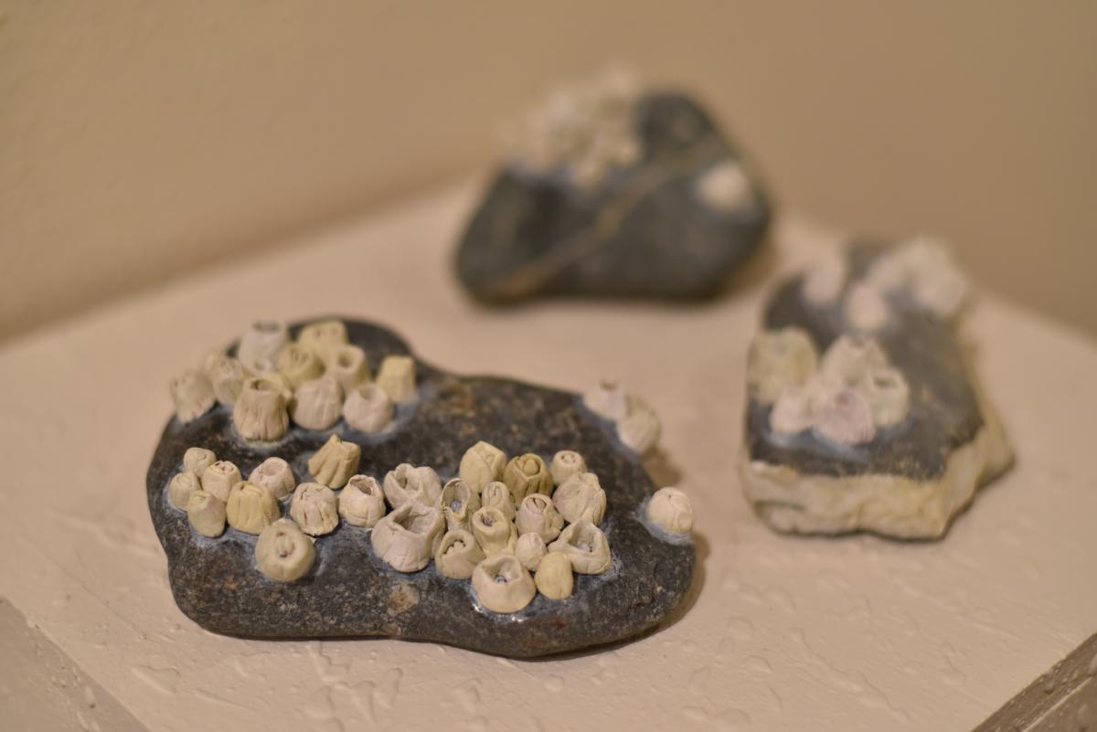
Robin Grace & Dana Van Burgh
Art making
into the unknown I am pulled
the ground is soft, hard
shifting
i stumble, spiral
i rise
laughing joy.
I like that the landscape is always changing.
Walking across Mud Bay life pulses. The push of wind. Day-glow green sea lettuce clings on rock. Lichen creep over Spruce and weathered bone.
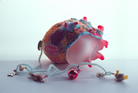
Incoming tides swallow the mudflats. I am driven to return to my studio on the beach.
I am a self-taught artist, combining knitting and objects found in the natural world. I am attracted to swirling shape and color. The waves fold over red and golden seaweed, the creek is dark and murky.
During college years in Greenwich Village, I frequently stopped to peer in the windows of a high end boutique featuring hand knitted dresses. The owners, like characters from an Edward Gorey book, strolled the neighborhood in sexy lace spiraling to their ankles, hair piled carelessly, looking straight ahead. Like a tattoo, this memory has never left me.
My excursions in knitting have evolved from conventionally structured garments to lichen shaped fragments. Struck by the beauty and wisdom in organic matter, I create knitting to intermingle and merge. Work is play but sometimes misery. Pieces come together and fall apart. I have also pulled them free, tossed them in the air and felt connected with the new.
In this collection, I have tried to capture bits of flow and texture observed in nature. Knitting organic fibers with metal wire serve a dual purpose providing resilience and sensual form.
Robin Grace
My love of photography started in my father’s photo Dark Room when I was a child. Watching the magic of a photo appearing in the developing liquid captivated me. Thus I began the search for those magic images.
Through my camera lens, I have focused on the details of nature which has given me an appreciation of how intricate nature is. The smaller details expand to larger details, becoming infinite.
One day when Robin and I were walking the bay, we realized we had a mutual fascination for the textures and flow of nature. We decided then to collaborate on an artistic endeavor. Working independently on our pieces, we were struck with our similarities of what we produced in our work. And so… here is the show.
Dana Van Burgh
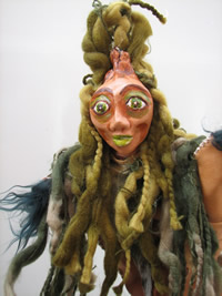
Tia Heywood
Feels Like Home
Barnacles
“You’re from Alaska?! I’ve never met an Alaskan before! What’s it like? Is it cold?!” This is the reaction I usually receive when I tell non-Alaskans that I’m from Haines. I’ve come to rely on using Alaska as a discussion topic, since people seem to be endlessly fascinated by where I’m from. Living far away, on the East Coast, I welcome the chance to reminisce about the place I love. However, when answering questions about Southeast Alaska I’m only ever able to scratch the surface. I talk about cold, snow, and daylight, but not about small details like witch’s hair and barnacles. For me, it is the combination of all these everyday aspects of the environment around us (and of course the people) that make Haines home.
Anemones
For my college art degree I had to create a senior exhibition. I knew I wanted to make sculptures that could be touched. Beyond that I didn’t know what the theme of the show should be. Eventually I settled into making a show about Alaska and nostalgia for home. I wanted to give people a better window into my life in Southeast Alaska than my verbal explanations could, although at the same time I knew I could never accurately depict home. So I did not try to be accurate. I focused on the feeling, both metaphorical and physical, of each piece rather than the adherence to reality. Blueberries became woolen, glaciers wooden, and rain plastic. I used my Alaskan foraging skills to gather supplies from scrap bins and even cafeteria tables. Being far away, I have learned to construct home for myself out of the materials I have on hand.
This six-week spotlight shares the same title as my senior exhibition and includes the same art with the addition of several pieces I made a year earlier (Structural Deformation 1-4) and a piece made this summer while at home (Barnacles). In addition to adapting the overarching artist statement I wrote vignettes for each piece, sharing a memory associated with each object. It means a lot to me to have this exhibition shown in Haines. I picture this room filling with visitors’ own memories associated with the objects of this show and their own experiences of missing home. This space is a celebration of the places we live in and love.
Tia Heywood
2016
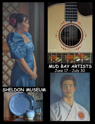
Mud Bay Artists
 When I first came to Haines in 1987, I heard that this town had the highest per capita number of artists – anywhere. I have never counted or tried to determine if this is true. And where does one draw the line anyway? Painters, carvers, writers, musicians? As a professional artist moving here from a small mountain community in California, I was somewhat astounded to find that many of my neighbors were artists of one form or another. Our neighborhood, all within walking distance, is called Mud Bay, after the tidal bay at the end of the road. A few historical predecessors, and many more with creative talent today, have been left out.
All the artists in this show live, or have lived, in the Mud Bay area of Haines, the neighborhood south of Letnikof Cove on the Chilkat Peninsula. We are many and diverse artists, some professionals, some with other careers. There are more artists in Haines proper, of course, and Mud Bay Road extends to town, but this group of individuals chose to live out of town at a time when we all lived beyond the grid, without power and telephones. This was our common bond and most of us knew one another. If we needed to speak, we did it in person. Only a few of these artists are still off the grid, and in this day of high speed internet and telephones, we older artists hold just a little nostalgia for “the good old days.”
Donna Catotti, guest curator
2015
Katie Craney
For Exploration, ink and paper in plastic
With a sense of place, our identity is defined, to a significant extent, by where we live and the history that has occurred to create that place. Once a place is ‘discovered,’ then follows the role of establishment and its crucial function for human survival. Through my research as an artist, I’ve looked at how humans integrate and transform the natural landscape into a cultural landscape.
 For Conquering, ink, wax, and paper on metal
We are on the brink of a new geologic epoch, the Anthropocene, the age of man. I look to human history – and my own identity in creating history – to ask difficult questions about the juxtaposition between the human world and natural world. My understanding is then exposed visually through the use of found materials, specifically discarded metal and plastic, to tell the story of how we integrate ourselves into the environment. I use line drawings to imitate the delicate balance between the human built world and the natural world. My work is small, to mimic the insignificance of mundane conversations and at the same time invite the viewer to have a more intimate view of the story being told.
Katie Ione Craney
Rebecca Brewer & Adrian Revenaugh
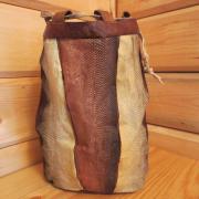 Salmon skin storage bags
The land, animals, plants and stones are my source of inspiration. I am a subsistence artist. When I make something it’s about forming a relationship with beings that have sustained me. I love to make functional things that are used everyday that bring back simple beauty into our lives.
Always interested in keeping ancient arts alive, I have worked in wood, bark, grass, root, wool, bone, and skin.
Rebecca Brewer
The people have been on the move for quite some time. Craving rest and nourishment, they are eager to build a hearth and settle in. There is food to harvest here, gear and clothing that needs repair. Essentials are laid out around the fire and each person sets about their tasks…. Welcome to camp, where useful things are made with what’s found around us, and a simple living can be had.
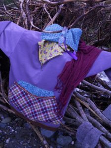 Summer-weight kuspuk
Figuring out which traditional styles of northern outdoor wear and comfy cabin textiles one can stitch together is my focus. I manufacturing things from my families hand-me down clothing using true patterns generously shared by friends and teachers.
I spent the month of August camping in the Upper Klehini while working on gear. Its always exciting to see what can be hobbled together to keep a person dressed, fed and, comfortably sheltered.
Adrian Revenaugh
Kerry Cohen
WINTER
reflections in clay
The ceramic forms in this show were made using the ‘pinched pot’ technique. Cohen was introduced to this method thrity-three years ago, when she had the good fortune to come across the book Finding One’s Way With Clay, by Paulus Berensohn. Berensohn demonstrated a relationship between movement, dance, and working with clay that captivates Cohen to this day.
Pinching clay is a slow process where the clay is pulled, slapped, pinched, and repeatedly moved in micro-turns. A beautiful asymmetry develops as each piece evolves.
Clay bodies have a surprising variability in texture and color, and as a result, each clay has its own personality. Cohen used oxides and clear glazes to facilitate sharing the unique and raw qualities of each clay body.
gratitude
for the low blue light of dawn
shifting moment to moment
the geranium light
emerging
illuminating the chilkats
gratitude
for the flowers on chilkoot lake
crystalline
forming gardens of their own
beneath moon and stars
gratitude
for my hands in clay
and for clay itself
black like the rain driven night
rich like the soil
long after leaves have fallen
bright like the red osier dogwood
dormant and waiting
gratitude
for the fire
transforming
the clay
and me
gratitude
for community
for friends and family
who inspire
in ways known and unknown
2014
John Hagen
Chilkat Beach in Monochrome: Landscape Studies in Black & White
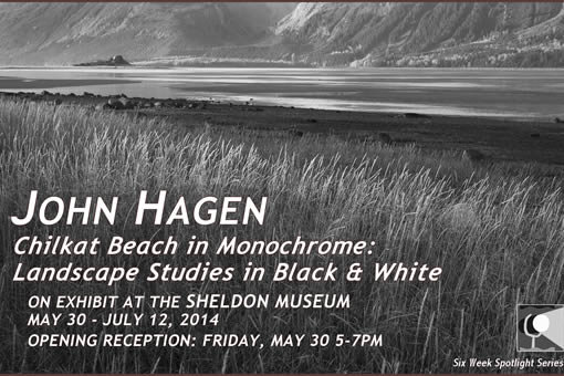
May 30 – July 12, 2014
“The Chilkat River estuary is a cross roads. It is a place where the river meets the sea. Birds meet fish. It is a place where land mammals meet sea mammals. In the spring and summer months it is a place of constant migration. Even the river itself is migratory in a way, depositing more and more material in to the Chilkat inlet. What is now the mouth of the river will be river flats sometime in the future.
This exhibit does not focus on those grand migrations which are all spring and summer based. This photographic exhibit is a study of the way winter comes. Slowly it creeps in, giving life a chance to escape or grow dormant. When winter hits, it plunges the valley in cold. There is an ebb and flood of north winds and south winds; the south bringing warm but wet weather and the north bringing bitter cold. When they converge they dump snow and lots of it.
With this winter, the summer is possible. Winter storms leave enough snow to feed rivers for the summer. The ice and snow pack provides shelter for the tiniest of creatures. The cold ‘hibernates’ predators or sends them south. Out of winter springs life.” – John Hagen
A photographer and digital artist, John Hagen was born in Sitka, Alaska and raised in the Southeast Alaska town of Haines. Hagen is Aleut and Inupiat. His first introduction to art was from his father, a master carver in the Tlingit style. Early on he was encouraged to pick up an art, and as a youth he had explored carving. He found instead his passion lied in creating art with a camera.
Hagen worked as a professional photographer for more than 13 years, working as a photojournalist for newspapers across Alaska and Washington. His photographs have appeared across the globe via the Associated Press. Hagen recently graduated from the Institute of American Indian Arts in Santa Fe New Mexico, where he studied different ways of using his photography.
Hagen finds the inspiration for his work from his hometown of Haines and the Alaska wilderness that surrounds it.
Ma’or Cohen
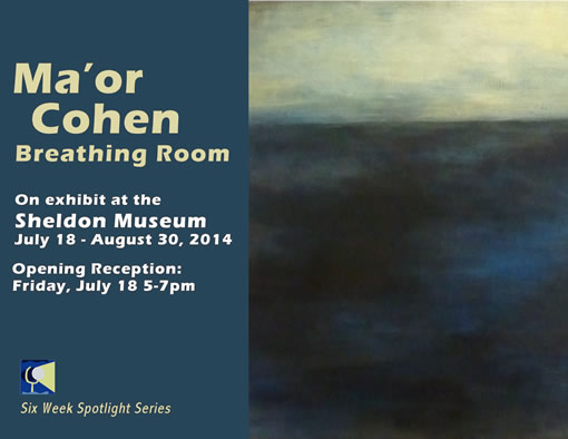
Breathing Room
July 18 – August 30, 2014
“This body of work is inspired by the local pallet as it reveals itself through winter. It is equally inspired by the landscapes of my childhood far off to the east, where the horizon was often a thin line in the distance and the land only slightly curved with dunes. In these paintings, the past and the present combine to form a new place, one that is tangible yet ethereal. It is a place I have never been to but find familiar.
When I started working on this series a couple of years ago, I was grieving the loss of a friend. As I often find with grief, all of my dead soon came to join the “party.” Emotionally raw and tender, I needed to convey these feelings of finality and loss. Some days were darker than others and so are the paintings that emerged from them. Eventually, I was less consumed by loss and my work became lighter.
I invite you to pause in the space created in these paintings.”
– Ma’or Cohen
Ma’or Cohen was born in the US and raised in Israel. She is a graduate of the Israel-Pollock School of Fine Art in Tel-Aviv, Israel. She has worked as a professional set designer and art director for film and television, and as a commercial window dresser since her graduation in 1998. She has exhibited in the Ramat Gan museum of Israeli Art as a recipient of the America-Israel Cultural Foundation Scholarship for the years 1998-1999. Ma’or has continued to pursue her passion for painting and art, and exhibited in various group shows in Haines, Alaska, where she has been living and raising a family since 2002.
This was her first solo exhibition.
Alexandra Feit
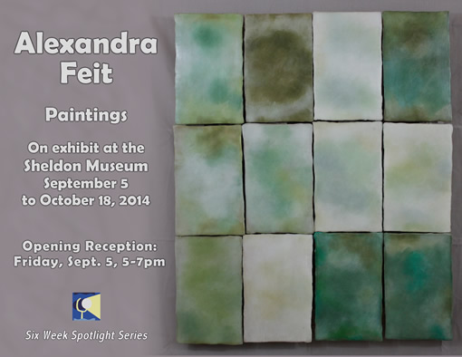
Paintings
September 5 – October 18, 2014
Opening Reception: Sept. 5 from 5-7pm
Exhibit available for viewing during regular gallery hours.
“My paintings are made of many thin layers of wax and pigment. The wax is repeatedly painted on and scraped off a wood board to create a lush, beautiful, layered surface. A sense of light and depth comes up subtlety through the layers of wax.
Winter in Alaska is a magnificent palette of gentle shifts in light. Generally there is white everywhere for months on end so the smallest hint of color screams its presence. I feel a similar sense with minimalist art, where the visceral sense of a piece enriches its simple form or color.
My work draws equally from minimalism and nature. Subtle shapes and colors lead one to the minutia of experience. I am interested in getting the viewer to slow down and enjoy the richness of quiet.”
Alexandra Feit
2013
William McRoberts:
Digital Art Photography
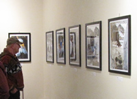
William McRoberts’ digital art photography on display at his opening reception.
April 2013
field2frame.photoshelter.com
“I was born in Pendleton, Oregon and graduated and left there in 1970. As I was growing up, I always had an interest in working with my hands and loved drawing, painting, carving and leather work. I spent 23 years in the Military and retired from the US Army in 2000. In my travels with the military I started getting into photography in the late 1970’s and have continued my love of art through the years. I have made saddles, rawhide and leather braiding and done some extensive woodwork carvings. I also continued to draw whenever the opportunity allowed it.
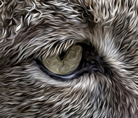
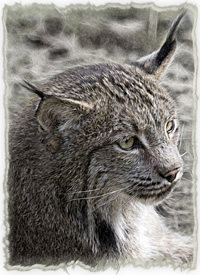
Upclose view of “Lynx” by William McRoberts.
In 1976 I made my first hand tooled saddle and chaps and made several braided products for various cowboys while I rodeoed. I have built and hand carved black powder rifles. Probably my most rewarding task was when I refaced a WWII Honor Roll while I was teaching at West Virginia University. It was completely dilapidated. I had the honor of carving a bald eagle that went inside it. I gave it a new paint job, replaced the broken glass with bullet proof Plexiglas and engraved all the new name tags. The unveiling ceremony was Memorial Day of 1994.
I purchased my first camera in 1979. Even though I owned my first camera in 1979, I never got completely serious about photography until 1999 when I purchased my first digital camera. I started combining my art and photography in 2000 when I started learning about digital editing and manipulation. It opened a whole new world to me.
Currently I am a Professional Photographer, digital artist and Instructor. I moved to beautiful Haines, Alaska, in 2008. My favorite photography and digital art is of eagles and bears. I feel very fortunate living in Haines, where I have access to both in abundance. The study of their habits and behavior these last couple years has helped my ability to photograph them, immensely.
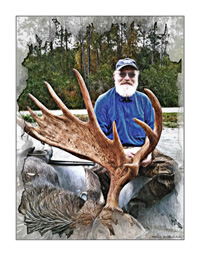
Digital art tribute to Richard Boyce by William McRoberts
My photographs have been published in the Northwest Travel Magazine, Holland America Cruise Line’s Cabin Book, Popular Photography Magazine, Outdoor Photography Magazine, Mile Post, Alaska Magazine and the Haines Welcome Center Directory. I have a bald eagle digital art painting in the VA Medical Center in Anchorage. My digital art has been and is still displayed in many different formats, from gallery art to paintings for individuals, posters and calendars, etc. I specialize in requests. My work is being sold in different stores throughout Alaska. I donate extensively to nonprofits organizations and community fund raisers. In 2010 I was selected by the American Bald Eagle Foundation to be the Artist of the Year, 2008 Photo of the Year, and 2011 Photographer of the Year.
I conduct the photography and Photoshop workshops during the Alaska Bald Eagle Festival for the American Bald Eagle Foundation. I also conduct private workshops and have taught photography and Photoshop at the Haines Middle School. I have been a member of the National Association of Photoshop Professionals for 6 years.
I have made over 130 Digital Art Paintings of Veterans, several kids sports and numerous wildlife and landscapes. I have done several graphic designs for many businesses and ads for various books and magazines. I was involved on a project for Jilkaat Kwan Cultural Heritage Center and Klukwan where I photographed and created several pieces of digital art work for them to display and sell.”
William McRoberts
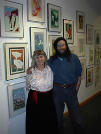
Donna Catotti
Donna Catotti’s opening reception.
Faces and Figures
June 2013
“I have been intrigued with the artistic value of the human form since I was a young child, regularly admiring William Adolphe Bougeureau’s classically painted “Nymphs and Satyr” at the Clark Museum in my father’s home town of Williamstown, MA. This large intoxicating painting mesmerized me, and I, a paint-by-number kid, wished I could paint like that. I have never lost my fascination for this particular artist, nor the portrait/figure genre.
“Peacock” by Donna Catotti.
I earned a Bachelor of Design from the UF Dept. of Architecture in 1973. The course included perspective, drawing, painting, abstract and compositional design. For an elective I took life drawing in the art department. I took it again, with painting classes as a post-graduate. Seeking skeletons to sketch, friends and strangers to pose for me, anatomy books, classes, workshops and conferences for 40 years, I have been honing my skills with the figure. I have a long way to go, and I am especially looking forward to the two-week intensive portrait/figure class at Studio Incamminati, Nelson and Leona Shanks’ school for contemporary realist art in Philadelphia next August.
“Dancers” by Donna Catotti.
Many subjects interest me. I love to start landscapes outdoors and much of my professional work has expressed my love of nature. The human form, however, is so endlessly challenging, I feel compelled to focus on it and keep trying. After 40 years of practice, I finally feel capable of doing something worthwhile with this genre. Hence this show.
I think the need to create is something inherent in an artist’s personality. Standing at the easel, I work to please only myself, not an easy task. In each of these figurative paintings, my hope as an artist is to portray some depth of human character and emotion that transcends the individual portrayed. When others view my work, find meaning, pleasure, or inspiration to take away with them, then I have succeeded in my efforts. You can preview the paintings online at www.donnacatotti.com. I hope you enjoy them.”
Donna Catotti
Tim Shields
Tim Shields works on display at his opening reception.
Herpetology 101:
Reptile and Amphibian Art of Tim Shields
August 2013
“The story in my family is that I was chasing “horny toads” in our east Texas yard well before the age of my first memory. My love of reptiles and amphibians has always been there and that is a deep mystery to me. Why am I attached to this group of animals, why do they fascinate me?
Well into my career as a wildlife artist I still hadn’t painted any of my favorite animals- they were clearly uncommercial subjects. I stuck to birds, charismatic mammals and pretty scenes. In the early 90s I rebelled against this limit. I was thrilled at the chance to take animals usually thought of as ugly and repulsive and to present their alien beauty.
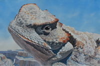
“Doug” by Tim Shields.
I love to play with prejudices against reptiles and amphibians. Few people go face to face with reptiles as I have- few get to see these faces. I often choose eye level or slightly below eye level views of my subjects- this enlarges them to dragon size. They are so strange looking and evoke such strong feelings that I am naturally prone to surrealism when I approach a reptile or amphibian work.
“Sage” by Tim Shields.
CaptionThis show presents 20 years of my reptile art. I have borrowed some pieces from collectors of my work (there is a market for reptile art!) and reworked a number of older pieces. My new pieces are a source of great joy. Starting last fall I have been painting reptiles and dinosaurs more than ever and I’ve never had more fun as an artist. A big dinosaur mural project has led me to the first stages of producing a wordless book about the 250 million year journey of turtle-kind through the age of dinosaurs and giant mammals and all the way to their present place in the world.
I have come to the point that I don’t need to understand my obsession with these critters- it is simply a part of me. Whether you enter this show with trepidation or eagerness, I hope to intrigue you and help you to see these creatures, and the world, with fresh eyes.”
Tim Shields
2012
Paintings by Carol Clifton
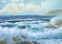
Ocean Waves oil painting by Carol Clifton.
May 2012
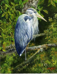
Heron oil paiting by Carol Clifton.
A Haines resident for over 40 years, Carol Clifton is as well known locally for her beautiful decorated cakes as for her painting.
Chilkat Mountains oil painting by Carol Clifton.
Primarily self-taught, Carol benefitted from the mentoring of artists Gil Smith and Miriam Cameron, and has attended workshops that have helped her with techniques she previously had to work out for herself, such as how to effectively paint ocean spray.
Carol mostly works from photographs for her paintings, but has spent hours sitting and studying nature directly for her work.
When asked to provide an artists’ statement for this exhibit, Carol preferred to let her work speak for itself.
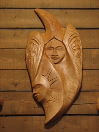
Jilkaat Kwaan Heritage Center
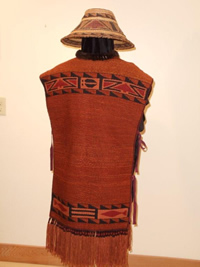
Subsistence Robe woven in the traditional Tlingit style by Lani Hotch.
July 2012
Eagle carving by Joe King.
An exhibit featuring the artwork of students and instructors from the Klukwan Jilkaat Kwaan Heritage Center.
Featured artists: Jim Heaton, Lani Hotch, Lorraine Kasko, Mary Jane Valentine, Carrie Valentine, Joe King Jr., Daniel Kanott, Jeffery Kanott Jr., Kory Pettman, Wililam G. McRoberts, and Alicia M. Morris-White.
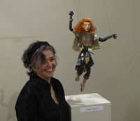
Tresham Gregg
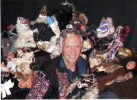
Tresham Gregg among many of his puppets.
Unique & Eclectic Supernatural Visions
August 2012
I like to play in a number of different mediums – each one is a new and different challenge. Each one has its own journey towards improvement. The artist within needs to create imaging goals and visions to bring forward criterion for self fulfillment. Paintings are an especially interesting opportunity to explore different ways of applying paint and playing with subjects beyond our reality.
A puppet by Tresham Gregg
Growing up in Haines in the mid-1900’s created many magical realms in my mind as well as the skills to make images of them. Tlingit Art, Culture, and Spiritual Thinking were and are a major interest and inspiration for me. My involvement with the beginnings of the Chilkat Dancers and Alaska Indian Arts shaped the direction of my artistic endeavors in several different ways. But the main concept that I found so fascinating about Northwest Coast Native culture was the idea of the Supernatural. Their legends weave human reality with supernatural beings and sojourns into spirit realms.
Over the years I have experimented with conceptualizing various spirit realms, supernatural ways of being, and interactions with Supernatural Beings. I now call this ‘Northwest Supernatural’, combining numerous tribal visions and various approaches to spirituality to create my own vision of the supernatural. These are the most recent of my attempts to create and define fantasy themes and images that reveal aspects of a different way of being and different frames of reference.
Wood carving by Tresham Gregg
All this may or may not have any bearing on the reality in which we live, but it usually involves parts of the human psyche and our interactions with others. In any case, the only real justification the artist needs to do something is the desire to do it at the moment. Eventually enough of these desiring moments work to materialize a body of images that have significance in developing the artist’s vision.
I think my love of traveling to distant lands and getting immersed in different cultures has contributed to my visions of spiritual fantasy. Each place that I go to for a period of time is like stepping into a different fantasy realm. I also like making art in different places and countries, doing drawings, paintings, carvings, masks, costumes and dance theater in many places on the planet.
I have worked with many people at home and elsewhere in my time, training many young people in various artistic skills. From carving apprentices, to jewelry making, to mask making, to dance theater and children’s theater, I have enjoyed playing and working with others. I like to try to impart a feeling of peace, spirituality and flow into my art as a reflection of harmonic approach which I have attempted to create within myself.
My current passion seems to be puppet making and puppetry, although I still enjoy my other mediums as well. Puppets are art that talks and can reveal a lot about the human condition by slipping into a parallel universe and different perspective. This puppet display heralds two shows that I did at the Southeast Alaska State Fair – The Enchanted Forest and the Galactic Adventure. I hope to be exploring more puppetry and experimental paintings in the near future.
2011
TAMSEN CASSIDY & JOE PARNELL
May 2011 Tamsen Cassidy
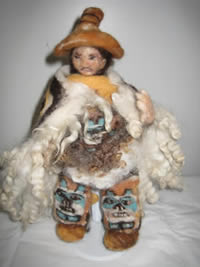
“Chilkat Indian” felted-wool scupture by Tamsen Cassidy.
Wool Sculpture
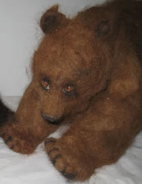
Brown bear felted-wool sculpture by Tamsen Cassidy.
“I sculpt in wool. I use all kinds of fleece from both sheep and alpaca. The wool is like clay in many ways and is manipulated with a very sharp barbed needle. Through continuous piercing of this wool the piece begins to take shape. With additional layers of wool, and additional color in the appropriate places, the piece takes on life. Wool is alive. Indeed, when it is worked one feels the life springing out of it. It is this life that creates the art and each one is unique, one of a kind and a being in its own right.
This exhibit, born in my mind’s eye depicts a harmonious scene encapsulating the inhabitants of Alaska and bringing out the spirit of the wool.
Most of what I do centers on the bears of Alaska: Nanuq (the Polar Bear), Black Bear and Brown Bear. I have also created Eagle, Raven and Orca to round off the energy of the wilderness. Of the peoples in my art, I have looked for inspiration to the Yupik people: berry picker, seal hunter, story tellers and kayakers; and also to the Chilkat Valley Tlingit: Chilkat Dancer.”’
Tamsen Cassidy has traveled the world and fallen in love with every culture she has encountered. This Alaskan culture has captivated both heart and imagination.
“Have you heard about the Mergansers” felt image by Joe Parnell.
Joe Parnell:
Felt Images
“Life is a mystery and in the end, depressing, because you are sure to die. But if you come to my art show, you’ll feel good for a little while. And if you come and you don’t like it, you can leave, but if you don’t come then you will never know if you should have left.
“North to Alaska” felt image by Joe Parnell.
I found the color felt at JoAnne’s in Juneau whilst wandering and I thought they had much color. I like color. It would be a crying shame to live in a black and white world.
The images are ideas in color. Ideas are bubbly to the reasoned world and scary to the Luddites. I try to be reasoned and not a Luddite. Ideas can be good (like art) or bad (like leaping before you look). I say we should vote for good ideas and eschew the bad. Was that the same thing twice?
Anyway, the felt it turns out is better than paint because the paint gets all over and is hard to clean up and the felt you can just sweep away. And with felt, you can just stack it up on itself until you have a painting and a sculpture in one. Hope you enjoy.
JIM HEATON
Jim Heaton hanging his “Eclipse” carving for his exhibition.
“Fish & Chips”
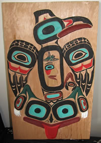
Northwest Coast Style Carving
June 2011
Northwest Coast Art is a vital living art form. The process involved in starting with a raw piece of wood and changing it into a sculptural form is exciting and satisfying for me, and I view each project as a learning experience for the next piece. Rarely do I have a plan, other than a basic idea—I wait until my wood is ready to carve—most of my planning and drawing is done on the wood rather than plotted out on paper. This is also how I teach carving. Each student carves their own ideas; so I constantly have to interpret their vision and instruct them on what to do to get their desired result.
“Raven Ascending” by Jim Heaton.
I’ve always felt that one of the best ways to progress artistically is to teach your art and attitudes towards art to others. This challenges me to continue moving forward and not to become creatively static.
“Halibut for Lunch” carving by Jim Heaton.
I have had the honor of having many carvings and designs accepted by various clans as aat.oow, or clan property, and see these items used in cultural functions. This recognition of my adherence to tradition and cultural standards validates my work and forces me to continue to improve my understanding of N.W. Coast Art and to strive to constantly do better.
Many of the pieces I’ve chosen for this show were commissioned for specific people or places. This allows the artist and patron to develop a more meaningful end product. Some of the pieces were done specifically to utilize the available space and some have been in mind for years.
RON HORN
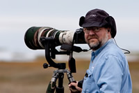
Ron Horn with his camera.
Natural Art: Digital Photography
July 12 – September 23, 2011
www.pbase.com/ronhorn
Ron Horn studied photography in high school, but didn’t become a photographer until he became a pastor in Haines, Alaska, in the fall of 2003. After six months in Alaska, he purchased his first digital camera in order to capture the inspirational scenery and wildlife. He is largely self-taught, through study and trial and error. Haines photographer Matt Davis offered instruction, but mainly Ron says “I tried different things that I read about.” Horn is a regular contributor to the Chilkat Valley News and his photographs have appeared in Alaska Airlines magazine, Birder’s World, the Anchorage Daily News and the Juneau Empire. In 2009 he was the American Bald Eagle Foundation’s Photographer of the Year. His specialty is nature photography, primarily wildlife, but his grandbaby Pearle, 2 ½, is enthusiastically teaching Ron how to photograph children.
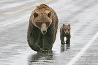
Mother Bear and Cub by Ron Horn.
As to why Ron is passionate about photography, there are several reasons. “My life has been outdoors; I grew up in the mountains of Northern New Mexico. I’ve been a hunter and fisherman all of my life, and photography is a way to share it with other people,” However one look at these photographs and it is clear that they are more than windows into Haines’ backyard. What makes them art rather than ‘encyclopedia shots of animals’ is his artist’s eye. “A painter starts with an empty canvas and adds elements to build an image; a photographer does just the opposite. You have to minimize distracting elements to focus the viewer’s eye on the story you are trying to tell. I spent 45 minutes waiting for those beaks on the juvenile Great Blue Herons to line up just right in order to get the comical scene I was witnessing.” There is also a huge element of craft behind these images. Ron has great technical skill, is comfortable with his equipment and remarks, “I’ve learned from the mistakes I’ve made. That’s what I love about digital photography, you get instant feedback. If I miss something, I can make adjustments to the camera and get it next time.”
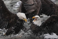
Fighting Eagles by Ron Horn.
Ron loves to teach photography and has taught Community Ed classes locally and at regional photography workshops. He enjoys working alongside photo-tourists and helping them get to the next level. Recently his favorite student, wife Jacque Horn, won the division championship and judge’s choice for her photographs at the Southeast Alaska State Fair. “I feel like a proud papa. I couldn’t be happier.”
Finally, Ron’s reason for applying for the Six-Week Spotlight: “I wanted to show my images in a large format. Everyone in Haines knows my photographs from my art cards or the newspaper. An image might make a cute or interesting card, but when you see it here, it has an emotional impact that I want people to feel, the way any artist does.”
2010
Amelia Nash/Andrea Nelson
Curious / Vicarious
Amelia Nash and Andrea Nelson at their exhibit opening.
April 2010
“Curious/Vicarious” was a life-changing experience for us. Being self-taught artists, working around each other has been revelatory. We share so much—similar aesthetics, ages and worldviews, a love for oddity and antiquity— yet turn out wildly dissimilar work. The differences are inspiring. We hope the viewer is, in turn, inspired to cultivate the curious in their own life, and to revel in the infinite possibilities of personal expression.
Andrea Nelson: Assemblage
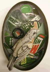
“Nest” by Andrea Nelson.
I am predisposed to the possibility that treasure exists all around me. I see it in rust, dirt, bones, corny figurines, nickel toys, diner menus and other relics that wear the weight of their past. These materials present themselves most everywhere I go, both when I am seeking them and when I am not; only very rarely are they purchased new.
After finding objects that are interesting independently, the challenge is incorporating them into a bigger whole in a way that highlights instead of diminishes their uniqueness. Like the number of words in a poem, no object can be disposable to the piece and no object can be missing. While a few pieces unfold quickly, some of my assemblages grow and change for years before they are committed to adhesives; and some of these are deconstructed regardless if they don’t reflect a compelling essence once finished.
“Sympathetic” by Andrea Nelson
Implications of the objects’ pasts, personal experiences, color schemes and other relationships between objects are some of the themes that guide each assemblage. The pieces also explore how framing and method of display alter the significance of objects, finding inspiration in museum exhibition and scientific handling of “specimens.” Most often, intuition and subconscious drive the ship and only after completion does the gestalt present itself.
I hope my pieces invite viewers to study objects they might usually overlook: what is considered too different, too common or outright disposable. Each assemblage creates a space for less obvious forms of beauty to exist.
Amelia Nash
“Ravens” by Amelia Nash.
Artists are ambassadors of the subconscious, translating their obsessions into a language that others can then explore and reinterpret. My work is a direct window into my overactive imagination, which is primarily concerned with the old, frivolous and forgotten. Utilizing simple materials and many layers of detail, I embellish on practices, objects and themes from eras past, creating microcosms meant to feel as familiar and authentic to the viewer as they do to me.
“Rabbit” by Amelia Nash.
In my animal portraits, reality takes a backseat to the idea that love can transcend time, spatial relations and species. This series is ongoing. My paper cutouts allow me to indulge the need for detail in a three-dimensional fashion, and deal variously with themes of obsolescence, mythology, voyeurism and nature’s opulence.
Debi Knight Kennedy/Sharon Svenson
June, 2010
www.debiknightkennedy.com
www.extremedreams.com
Debi Knight-Kennedy next to “Justice” a puppet from her Seven Virtues.
Debi Knight-Kennedy:
Superheroes & Goddesses
the seven virtues and their eclectic collection of friends
In my early 30s I came to know this happy truth about myself, that I am a carver. I started out by whittling driftwood with a Swiss Army knife. I liked it. I asked my brother, also a carver, for some practical advice. “Two things,” he said, “find some carvers to hang around with, and learn to keep your tools sharp.” So I did.
Within a few weeks I met Duane Pasco, a master carver and teacher in the Northwest Coast Native style tradition. He became my friend and mentor, teaching me in equal measures carving skills and life skills. And he introduced me to puppets. He invited me to perform one of his creations, a beautifully carved self portrait puppet, in a traditional longhouse ceremony. I was bitten, smitten and thoroughly enchanted.
“Kate and Jane” puppet by Debi Knight Kennedy.
Fast-forward 15 years to Haines, Alaska. About this time I had recently changed gears from Northwest Coast carving and was primarily making mixed media figurative sculpture using my carving skills and combining them with an earlier passion for textiles and a brand new fondness for found objects. I actually hadn’t thought of puppets in years. Then along came Byrne Power and the Lilliputian Puppet Sideshow. My life hasn’t been the same since. I seem to dream, live and breathe puppets: making them, writing scripts, performing… For me, puppets are proving to be a perfect means of communication and expression, not to mention providing some of the most fun I have ever had! But I also see them as fine art. I love seeing them hanging around my studio and it occurred to me that I might set out to make a series of puppets specifically as ‘objects of art’.
“Vincent” sculpture by Debi Knight Kennedy.
Inspired by a piece of an old boot, my first Super Hero, ‘Truth’, was born. Hey, what about doing a female version of the “Fantastic Four”. Maybe the “Fabulous Four”… But who would be next? I happened to come across a cast off, broken, metal mesh purse and ‘Justice’ was soon to follow. About here in the story the ‘super powers’ employed by my Heroes turned into Virtues, of which there must be seven, right? The project expanded. Along came ‘Compassion’ followed by ‘Wisdom’, ‘Feminine Divine Wisdom’ to be exact. Oh my, the fine line between Super Hero and Goddess seems to have been crossed. Next came ‘Love’ then ‘Beauty’ and ‘Grace’. As usual, I followed them, never knowing who was coming until well into the piece. A lot of fun and surprises were to be had along the way.
And that is my story of the Seven Virtues. Their eclectic friends actually came first over the course of a two year experiment I called, “Get up every morning and make whatever comes up.” In total, this show represents three years of my most creative work to date. I truly appreciate this opportunity to share it.
Sharon Svenson before her mosaic
“Raven’s Stash,” which is decorated
with a plathora of local trinkets.
Sharon Svenson:
In and Outside the Box
Art comes from the soul, which is received through the heart and is perceived by the brain.
“Ice Falls” by Sharon Svenson
“Mosaic: a surface decoration made by inlaying small pieces of variously colored material to form pictures or pattern.” (Webster’s Dictionary)
There has been a gradual and natural evolution in my work from weaving rugs and tapestry to mosaic. What they have in common is the fascinating process of building up small areas of color. Woven tapestry first captured me with its potent and saturated hue. This is not unlike mosaic in which colorful, textural and reflective fragments are assembled and arranged giving birth to a picture or pattern. This is not a cerebral process, it’s a visionary one, painting with fragments. Nipping pieces and fitting them together to create an image is both relaxing and mentally stimulating. It is easy to get lost for hours in the process.
A visitor looking at works by Sharon Svenson.
In and Outside the Box represents for me a metaphor of going beyond what I have been creating for several years, such as functional art mirrors, to exploring and pushing myself beyond the functional. Also, literally using the box as one of the forms to mosaic into shrines or altars. Mosaic art can be applied to every surface imaginable. I feel I have just begun to explore the possibilities.
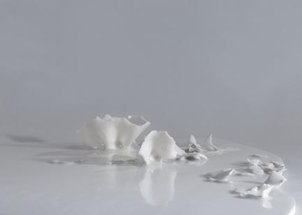
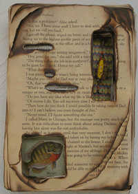
Sarah Cohen
Sarah Cohen at her exhibit opening.
“On My Mind”
Multimedia glass sculpture by Sarah Cohen.
Glass & Sculpture
July 2010
“Sprout” multimedia glass sculpture by Sarah Cohen.
I enjoy using many different sculptural media. More so than being defined by glass or metal or paper, my work is driven by the process through which it is created. I often work in a very tedious and meticulous manner. I am attracted to small details and repeating shapes and textures. My involvement with the materials is as essential to me as the final product. I must touch and be part of each element in the work. As the piece grows and changes I too am growing and changing along with it. At its conclusion I see the work not as an inanimate object, but as a form that is now charged and vibrating with the energy that I have woven into it.
George Figdor
George Figdor at his exhibit opening.
We All Share This Planet
A Photographic Connection with People from Other Lands
September 2010
“This show is dedicated to the memory of Bobbi Figdor—my great travel partner and my biggest photo fan. This show is also a tribute to the tenacity of my little travel partners at the time—my kids Rob and Alison. They enthusiastically tagged along on all of our overseas adventures and were forever demonstrating that the lack of a common spoken language is no barrier to building friendships with other people in other cultures. Like the dog and the bear, in their playfulness they unwittingly chased many photos my way.”
Untitled photographs from India by George Figdor.
These images represent an instant (usually about 1/60th of second) when many things came together to create a special moment in time. Since photography is essentially “writing with light,” it’s really about what the light at that moment is revealing about the subject. But other compositional elements have to be working at the same time for the image to have an impact—the color, the background, the angle. For people shots, it’s also about clicking the shutter button at the right instant to successfully capture the expression and mood you are noticing. There are a lot of near misses in photography.
Untitled photographs from Indian by George Figdor.
Collectively, these photos represent years of travels in far off places. The best experiences have been those in which personal connections were made with the people and their culture. Success in getting images that convey something meaningful about people from other places comes most often when you are not trying to steal an image on the sly but are actually making an honest connection with your subject. Sometimes people responded with eye contact—and with either a smile or a more intent glance (trying to look serious about having their picture taken), but often they just went about their business, allowing you to shoot away. In one of the images in the show—“Gotcha”— I am actually caught in the act of trying to steal an image!
Martin Luther King said that one of the great challenges we Americans face is that when it comes to other people and other cultures, we think we have everything to teach and nothing to learn. My goal in traveling was to be a learner and to provide such a learning experience for my children. The great lesson I have learned is that we are all closely bonded in a common human experience and that mostly everyone loves food, kids, and laughter (with the exception of airline ticket agents).
Putting this show together has been a deeply personal experience for me. The process started with hundreds (thousands?) of boxes of old slides. Opening each box unleashed a flood of memories. As a photographer, I believe I must have at least one brain cell that is dedicated to each image I have ever taken. So, as I was scanning hundreds of slides last winter, I could feel the “on” switch being ignited in little far off places in my brain and heart. It produced a blend of sadness and joy, but in the end all those emotions contained in those little yellow Kodak boxes had to be released—and digitized!
2009
JOHN SVENSON
Woodblock Retrospective
“Eldred Lighthouse” wood block print by John Svenson.
March 2009
www.extremedreams.com
John Svenson has lived and painted in Southeast Alaska for more than two decades. As a mountain guide and climber, John is known for his unique translation of the mountain image through painting and woodblock printing.
“While sorting through and “rediscovering” many block prints of the past for this show, I was amazed at the time I have dedicated over the years to this unique and exciting medium.
“Heron Sun” wood block print by John Svenson.
As with anything, if you stick with it there is a necessary evolutionary process. The artist has to become familiar with the uniqueness of their chosen materials learning how to combine them and produce a pleasing end result.
This is true with block printing. Your “paper” is either a piece of wood or linoleum which you cut into with knives or chisels. Then you have the inks and papers of which there are hundreds to chose from.
After saying that, and as I look at these prints which I produced over a 25 year period, I see high points and low. There are brilliant moments combined with what I’ve referred to as “Drooling geek” phases, when the brain almost shuts down and motor nerves take over. These can tend to be my personal favorites.
“Hot Dogs” wood block print by John Svenson.
In the world of professional art I have established my reputation as a watercolorist, which my mentors approached with a decisive and bold style using large brushes and very wet paper. I have always, and continue to enjoy the looseness and spontaneity of watercolor although over the years I’ve tended to take breaks and work with other mediums; pen & ink, woodblock, video, Mountaineering, hot glass, to basically “dry out” and gain fresh perspectives.
At this point in my art career (it’s taken 40 years!) I have whittled my focus down to basically 3 disciplines; watercolor, woodblock and molten glass. Knowing I will never give up any of these 3 I have been, almost subconsciously, working them together resulting in extremely challenging creations that have me, not only excited, but freaked at times! In this exhibit I have included examples of the glass connection in addition to a few local kids block prints, which are all inspirational.
Climbing steep rock, can’t forget that, it’s the best!
In retrospect—thin air and avalanches are for the birds. I’m outta’ there.”
-John Svenson
KERRY COHEN
Kerry Cohen next to her peice entitled “Self Portrait.”
Unfolding
May 2009
www.kerrycohen.com
“The Gathering” ceramic sculpture by Kerry Cohen.
“The work I produced over this past winter comes straight from my heart. I am grateful for the quiet solitude our long winters provide, as they give me space for introspection and time to explore my art.
I have always loved the raw earthy nature of clay, and it has been exciting to work with it in a more spontaneous manner.
“Prayer for Troubled Youth” ceramic sculpture by Kerry Cohen.
My Previous work has usually been representational and executed through a safe and controlled process. Learning to acknowledge and express the deeper voice within myself made room for an organic unfolding of shapes and textures, mirroring the natural world.
Traditional Japanese Chiyogami and Washi papers provide my work with a translucency, vibrancy of color, and a quality of softness that is not available in clay. I find that the contrast of mediums: hard and soft, opaque and translucent, strong and fragile, hold a particular beauty.
Each piece in this show was created in response to my own experience of growth and marks a transformation in my creative process.
I hope these works speak to you in some special way.”
Kerry Cohen
2008
BEVERLY SCHUPP:
“Chilkat Breakup #2” by Beverly Schupp.
Pastel Paintings
May 2008
Untitled pastel by Beverly Schupp.
Often seen around the Chilkat Valley at her easel painting the local landscape, Beverly Schupp was born in 1949 and grew up in Banksville, New York. She earned a B.S. in Art Education from the State University of New York at New Paltz and taught art at Putnam Valley Middle School in Putnam, New York before moving to Alaska in 1977.
In Alaska, Beverly first worked for the Takotna Community School as an art teacher, classroom aide and substitute teacher. From 1982 to 1990, she was an itinerant art teacher, traveling by bush plane to village schools in the Iditarod Area School District. She received multiple “Percent for Art” commissions for schools at Takotna, McGrath and Shageluk. After completing her Alaska elementary school teaching certificate in 1992, Beverly taught in several villages until 2004 and also taught drawing and painting classes for UAF (University of Alaska, Fairbanks) McGrath Rural Education Center.
“Cathedral Peaks” by Beverly Schupp.
Over the past twenty-two years Beverly has continued honing her painting skills through university classes, summer arts festivals and various outdoor workshops in watercolor, acrylic, oil and pastel painting held in Denali National Park, the Brooks Range, New Mexico, Washington, and Maine.
Beverly and her husband, Marc Miller, retired from bush teaching and now make their home in Haines where Beverly focuses on her second art career.
She has exhibited works in several Haines galleries and the local branch of First National Bank, Alaska, and has participated in University of Alaska Fairbanks student shows, the Southeast Alaska State Fair and in Alaska Watercolor Society juried shows in Fairbanks and Anchorage.
ROD WEAGANT
Rod Weagant next to his oil painting “Streamside” on display during his exhibition.
Oil Landscapes
July 2008
www.artiqueltd.com
Rod Weagant first came to Alaska in 1966 to serve in the Army at Fort Richardson. He quickly fell in love with everything about the state and eventually found himself working for the National Park Service in Anchorage. In 1973 he accidentally wandered into an exhibition of paintings by some of the great Alaska landscape painters. He was most impressed by the power of Sydney Lawrence’s work and the simple honesty of Ted Lambert. The outdoor life of these painters so appealed to Rod, that he immediately quit his government job and entered art school.
Tooltip trigger goes here.He earned his BFA in painting from the University of Washington in 1978. His intention to return and paint Alaska was sidetracked to Eastern Washington, where he met and married his wife Jane and raised a family. In 2000, he and Jane fulfilled the dream of returning to Alaska when they moved to Haines. Rod loves the small town atmosphere and the proximity to great landscape subjects. The combination of the fishing industry, beaches, mountains, glaciers, alpine tundra and the Yukon interior provide more than a lifetime of painting inspiration.
“Yukon Fall” oil painting by Rod Weagant.
Rod’s mentor, the Harlem Renaissance artist Jacob Lawrence, advised him to “accept the challenge about which he felt most passionate.” Consequently he has spent the last 25 years trying to communicate the wonder he feels about our landscape, by balancing the academic formalist background with the pure emotional response he feels when surrounded by the natural world. He travels the Yukon, Alaska, and the western United States painting and conducting workshops in plein aire painting. He has had over 40 one man exhibitions and has participated in numerous group shows including 3 museum shows benefiting the Nature Conservancy.
He is represented by Artique, LTD (Anchorage), New Horizons Gallery (Fairbanks), Allison’s Gallery (Manson, WA), Confluence Gallery (Twisp, WA) and Extreme Dreams Gallery here in Haines.
SUZANNE McCOLLUM
Visitors admiring Suzanne McCollum’s pastels at her exhibit opening.
Incubating
September 2008
“Wishing Well” pastel by Suzanne McCollum.
Suzi taught herself to draw in dreams as a child (true story). She attempted formal artistic training in college but did not take well to it, preferring to learn the hard way.
She has made countless baubles, doodads, puppets and fairies to support herself in her travels over her years of wandering and began to paint in earnest when she found Haines. She has been painting for ten years now and has just begun to delve into ink and quill.
“Seal Sunset” pastel by Suzanne McCollum.
Suzi calls her watercolors her “tourist trade” and credits her mother with the idea of painting something people may want to buy. The acrylic paintings however are products of her heart.
Her artistic philosophy: “Color follows light and a line always knows where its going, though I never know where I’ll end up.”
She is showing 39 paintings for her 39 years (“its actually 40, but who’s counting”).
2007
Serigraphs by Donna Catotti
Donna Catotti and husband Rob Goldberg infront of Donna’s work in the Museum’s Hakkinen Gallery.
26 Years of Hand-Printed Originals
April 2007
www.artstudioalaska.com
“Black and White” by Donna Catotti.
Born in Bennington, VT in1950, Donna Catotti has been painting, drawing and creating since she was a young child, often visiting the Sterling Clark Art Museum in Williamstown, MA, where she was inspired by Adolphe Bouguereau’s 19th century painting “Nymphs and Satyr”. After a semester of fashion design in NYC in 1968, she returned to Florida to earn a Bachelor of Design with high honors from the UF Dept. of Architecture in 1973. Moving to the Sierra Nevada high country in California, she began doing free-lance commercial art to support her love of backpacking, skiing, and river-running in the Grand Canyon. It was during this period that she learned the silkscreen process from sign-painter friend Bob Shedd. Focusing her creative efforts on fine art in 1979, Donna opened her first public showing of watercolor paintings in 1980 at the Pacific Grove Art Center on the Monterey Peninsula.
“Last Light of Dayon Delicate Arch” by Donna Catotti.
With her art career well underway, Donna commuted between California and Haines from 1986-1994, while she and artist/husband Rob Goldberg hand-crafted their home studio and gardens from the forest on the Chilkat Peninsula, where they now raise two boys, Aihan and Martin.
Besides serigraphy, Donna currently works in pastels and oils, and is exploring sculpture for bronze casting. Her work can be seen at the Juneau hospital and the Alaska Marine Highway building as well as in galleries throughout Alaska and in California.
Alexandra Feit: Installations
Alexandra Feit in front of “Shimmer,” one of her installations designed specifically for the Museum.
August 2007
www.alexandrafeit.com
Alexandra Feit moved to Haines six years ago. She has a master of Fine Arts Degree in both Painting and Sculpture and merges her interests in 2-D and 3-D work in her installations. “Installations” features work designed to stimulate thought about what art is and can be. The show offers art as a fun & playful experience while continuing the aesthetic traditions of light, space, color and texture.
“Telephone Doodle” art installation by Alexandra Feit.
The artist draws her inspiration from many sources, including the following artists: Eva Hesse, Jessica Stockholder, Sol Lewitt, Robert Ryman, Agnes Martin, Martin Puryear, Yayoi Kuzama, Richard Serra, Annette Messager, Wolfgang Laib, Andrea Zittel.
“Bubbleyum” art installation by Alexandra Feit.
Installation art became a movement in the last decades of the 20th century and has fully blossomed now in the beginning of the 21st century. The art addresses the entire experience of moving through space, often using multi-media. Sometimes it’s designed to fit in a particular space, other times the work itself creates the space. “Telephone Doodle” and “Shimmer” were designed specifically with the Elisabeth S. Hakkinen Gallery space in mind.